Cracker Barrel Launches New Logo - But There’s So Much More To The Story #MusicMonday
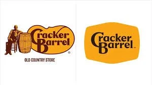
Last week, Cracker Barrel rolled out a new logo much to the dismay of many and much to the dismay of Wall Street where the stock dropped about 10%.
The reaction shouldn’t have been a surprise, and the CEO certainly took it in stride, as most logo makeovers get a similar immediate reaction. In fact the redesign took the shape of recent logo trends: minimalistic, modern, and somewhat sleek.
Gone are the symbols of the Cracker Barrel brand essence from the logo: the barrel, the “old timer,” the rocking chair, and the copy “Old Country Store,” so many jumped to the conclusion that the restaurants and the stores are radically changing as well. Truth be told, these folks missed the rest of the story in their haste to voice their opinion on the design.
If you are paying attention, this particular CEO has the entire narrative and plan down and is playing the long game here. And that’s why she took the reactions in stride, because she has a plan! And it’s much bigger than just a logo swap.
The logo change is timed to a roll out of restaurant/store modernizations, menu updates, and a new marketing campaign to signal all of the changes, all of which she says are still very much true to the core of the brand’s values of “country hospitality.”
Here is CEO Julie Felss Masino talking about her plan last week while the logo was being announced …
It’s all smartly timed to a new marketing campaign featuring country music star Jordan Davis, which does indeed capture the spirit of enjoying time at a Cracker Barrel restaurant with family and friends …
And here’s Jordan’s song “Ain’t Enough Road” that is featured in that Cracker Barrel film (this is a #MusicMonday post after all!) …
Now if folks had taken a minute before reacting, they would have understood the full story and evaluated the new logo in full context. It’s part of a full modernization of the business, much like other brands have also completed to stay current and competitive.
I found this “chart” (although I don’t know who to attribute it to), so take a look at other recent “modernizations” in the quick serve restaurant space (although note that Cracker Barrel is more in the fast casual restaurant space) …
Interesting to see them lined up … you could easily argue that these brands are getting too watered down and losing their essence in the process of updating. I would say yes, perhaps, it’s starting to feel that way.
While there is a clean and modern aesthetic to the look that makes them inviting and fresh, they are losing a bit of their brand essence. While on trend and up to date, for sure, I would advise adding some more unique branding elements to make the look their own.
Truth be told, Cracker Barrel is unique and it does hold special bonds for people. People converse fondly of either visiting it with grandma or visiting it on the way to visit grandma. Even I fall in that camp myself! So the emotions run deep which is the sign of a rich brand. So of course reactions will be swift and deep as well.
Removal of the “old timer” (or “Uncle Herschel”) from the logo sparked considerable conversation, rightly so, but his breakfast recipe is still proudly featured on the new menu so rest assured. And the interior design is still very much the country character of Cracker Barrel so that remains in all that people love, including the rocking chairs.
To my eye, a little updating and modernization is what keeps a brand fresh and when you have the full brand narrative and business rationale behind it, all the pieces are intact. That is certainly the case here, although I would agree that an indication and reminder or two of the brand essence in the new logo would have helped the case.
Oh and that CEO, she says her employees are pleased with the modernization and her sales are trending up in the restaurants. Full picture. But at the same time, the company has acknowledged the upset and has acknowledged that they could have done more to keep everyone informed of the changes. And they again have reminded everyone that all that makes Cracker Barrel the brand that it is remains intact. Full picture.
What’s your experience? JIM
P.S. - Update - the company has since come back around to say that they are bringing back the new logo in response to all of the, shall I say, feedback. Listening is a good thing, especially when it’s done in due course and with customers and employees. Which I would hope is the case here, and not just in response to social media commentary. I hope they dig into the feedback with their constituents and correct course in the best strategic way possible, as opposed to being reactionary. Let’s keep on eye on how this all progresses. Lots to be learned here. As I always say, “marketing is a spectator sport.”


