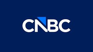
The New CNBC Logo Debuts
Source: CNBC
Lately, logo changes have typically been causing quite the stir but this one from CNBC went largely unnoticed.
Yes, CNBC changed its logo, dropping its famed peacock feathers and replacing them with a triangle. It’s all a part of the spin off of the company from its former parent company Comcast NBCUniversal to a new publicly traded company called Versant. The new company also includes USA, Golf Channel, and E! With the parting of NBCUniversal, so too is the parting of the brand equity of the NBC peacock feathers. Too bad because that’s a lot of brand equity!
Perhaps it was the timing as it happened right before the holidays.
Perhaps it was the fact that the news had already been announced so the logo wasn’t really all that newsworthy.
Perhaps we’ve already seen other parts of these corporate transactions lose their peacock feathers so it’s not a shocker (MSNBC changing its name to MS NOW and dropping the logo elements as well).
Perhaps we are all just feeling logo fatigue at this point.
Or all of the above.
The truth is, if you want avoid some drama, make a change during a busy season!
I will say that the logo is crisp and clean and reads well, especially on a mobile device where most of us are reading these things anyway!
But those peacock feathers do have a long heritage and a lot of brand equity which is still retained in the core NBC and NBCUniversal brands. I’m not sure we will see that changing, or at least not for awhile.
What’s your take? What’s your experience? JIM