“You Know Where” from McDonald’s New Zealand
Source: McDonald’s
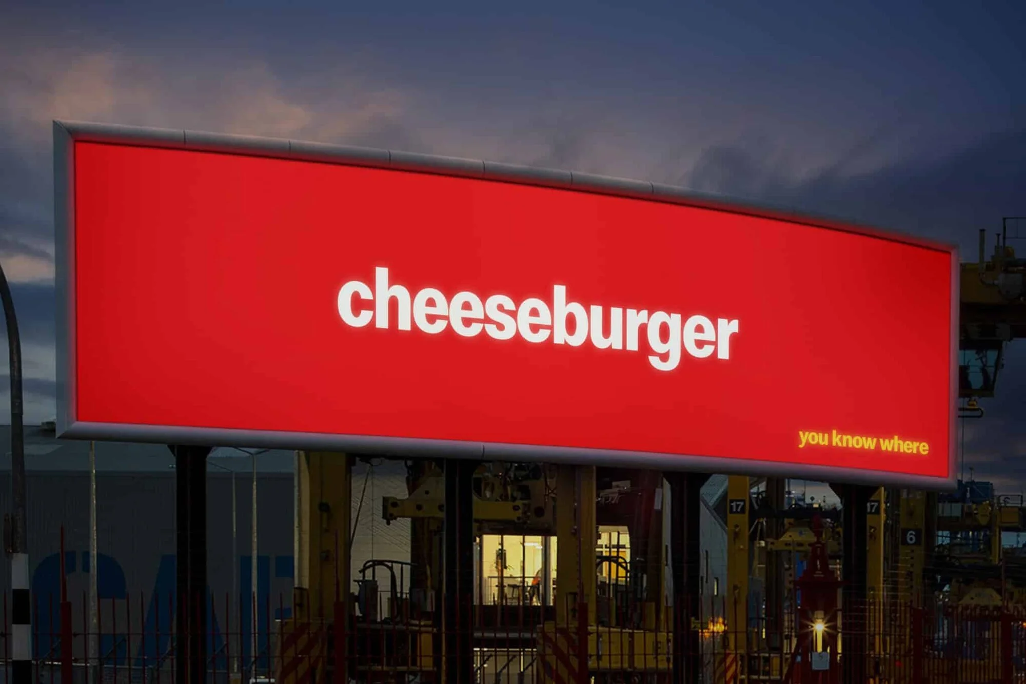
In the visual above, would you have known this outdoor ad was from McDonald’s if I hadn’t put the brand name in the title of this blog post?
I sure knew, instantly.
You know you have powerful branding when you can strip away the logo and virtually all other brand marks and the creative asset is still undeniably recognizable for its brand.
That's exactly what McDonald's New Zealand is banking on with their new outdoor campaign, "You Know Where."
The creative is culled down to just an iconic menu item name and the copy line "you know where." Nothing else. Well, except the McDonald's typeface and color scheme.
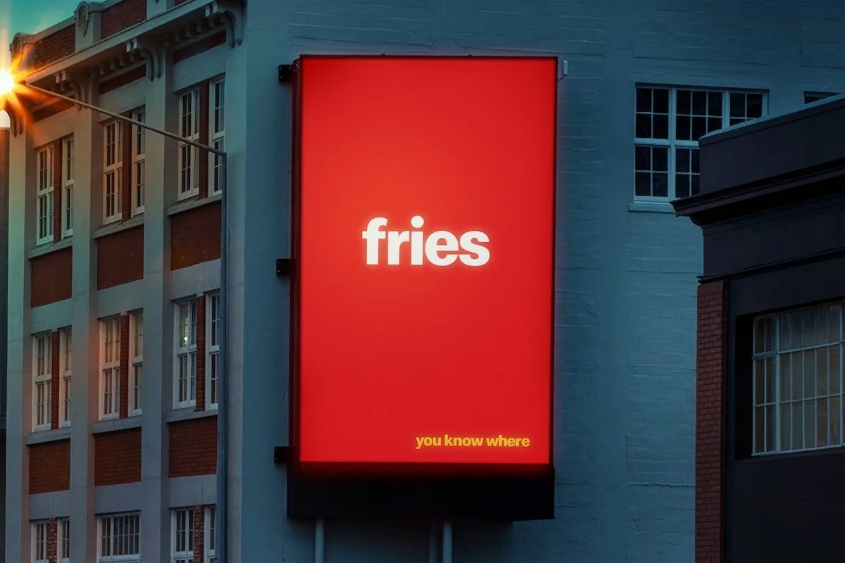
Source: McDonald’s
It is still instantly recognizable despite the absence of a logo. No iconic arches either. No "I'm Lovin' It" tagline. Oh yeah, no product photography to capture your attention and spark your appetite.
Nothing except for typography and primary colors. Along with a bold marketing assumption: you already know what we're talking about.
Not many brands can pull this off. It takes decades of consistent, patient branding to get here. Really patient. But when you do, this is what the payoff looks like. You win affirmation that your brand has penetrated culture so deeply that you don't need to explain yourself anymore.
This kind of creative confidence is rare. I’m lovin’ it :).
Could your brand possibly pull off such a move?
What’s your experience? JIM
P.S. — This reminds me of the Heinz experiment where the brand anonymously asked consumers to draw a ketchup bottle. The overwhelming majority drew a Heinz bottle. Same principle: decades of branding so strong, it becomes the default that is firmly embedded in peoples’ minds, with love.