Spotify “Temporary” New Logo
Here’s something for us all to think about … another new logo and another day of backlash.
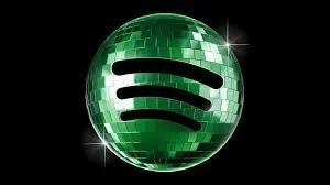
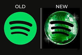
To honor its 20th anniversary, Spotify released a new logo featuring a glittery disco ball behind its iconic sound waves.
Let's just say the design didn't get people dancing. The complaints came rolling in that it was too pixelated and too hard to read on mobile. The brand quickly responded by saying the design was just temporary for the anniversary and will revert back to the original logo. The brand noted that this was as planned.
So what happened here? Planned all along just to celebrate the milestone? Or a quick response to avoid further backlash? And was the backlash the result of a disco ball bringing back decades of baggage still hanging around from the anti-disco movement?
Hmmm.
Either way, the brand responded to the backlash.
But truthfully, new logos always get backlash. That's just the territory we are in now. Brands know this. So the question isn't whether people will complain, it's whether the brand stands firm or folds. Planning ahead is the key.
Personally, I like the energy of the new logo. It feels fresher. More musically oriented and I feel more movement from it. But then again I like dance music.
I would keep it.
But I do wonder if the brand missed an opportunity to lead here. So even as they switch again, perhaps they could switch to something that is new, to make an even bigger point. Switching back to the old logo just feels like a defeat to me.
But that’s just me. I’d like it to feel like a refresh, not like a retreat.
At the end of the day, a marketer's job is to reconcile brand conviction with consumer response. And sometimes those two things are very difficult to align. I respect that and I respect the plan.
What would you do? What's your experience? JIM